House in Wilanów


Author:

Jakub Szczęsny

Co-author:

Jolanta Szczęsna


Collaboration:

Zygmunt Fit


Date:

2007 – 2008 project design

2009 – 2011 realisation


Location:

Warszawa Wilanów


General contractor

Ekipa s.c.


Photos:

Bartek Warzecha

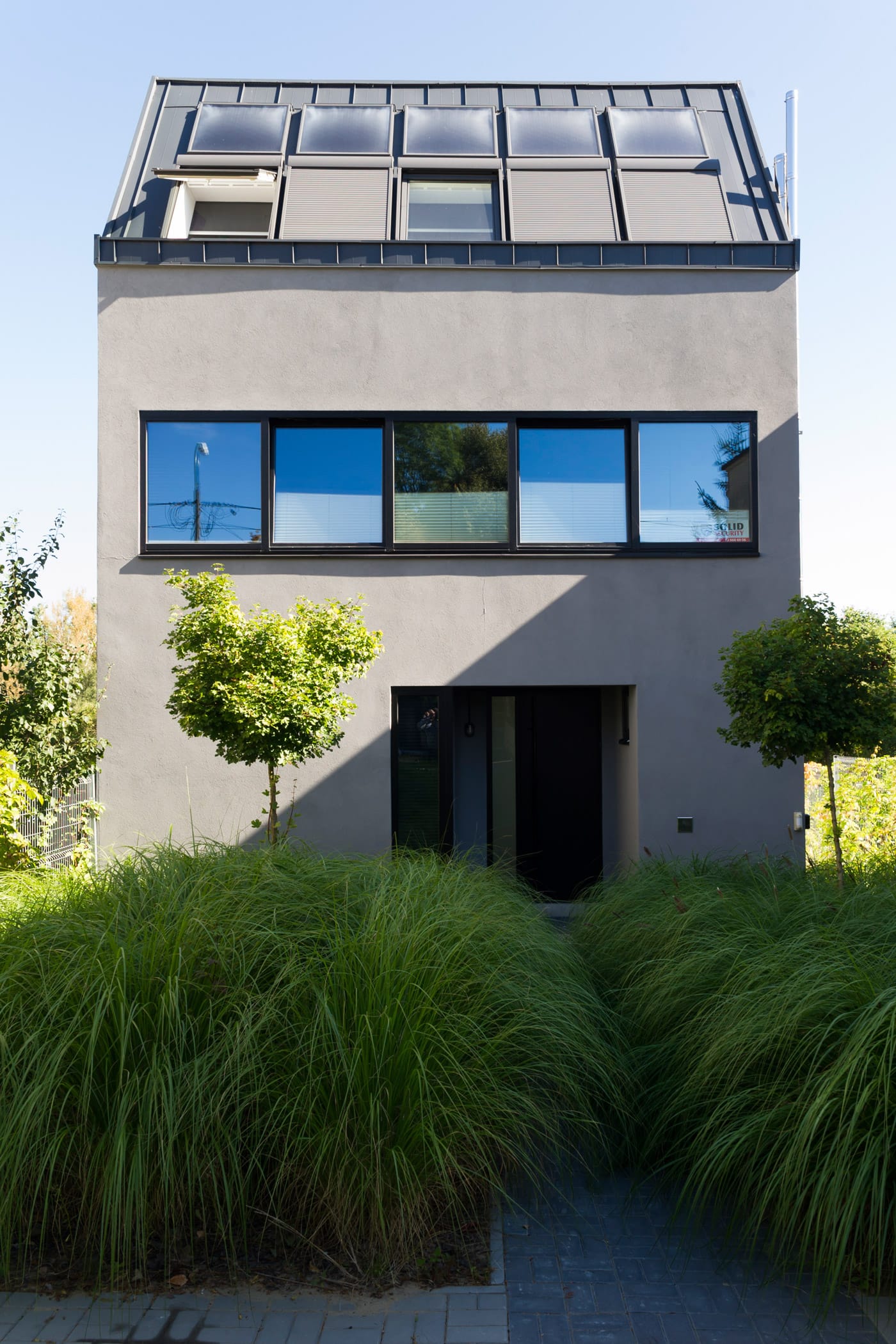
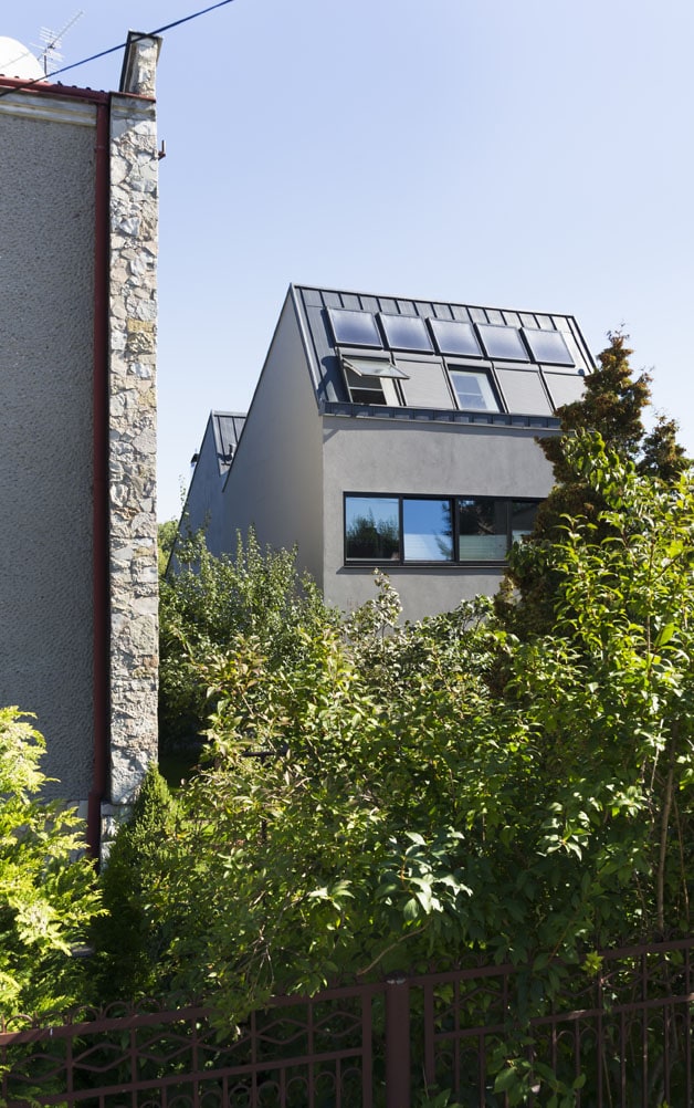
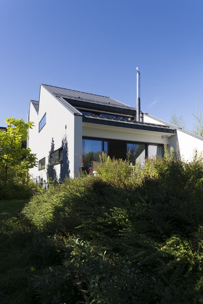
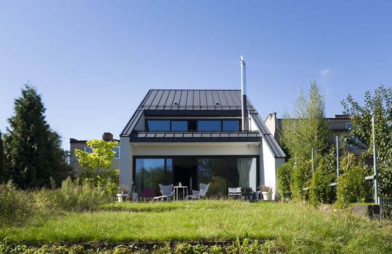
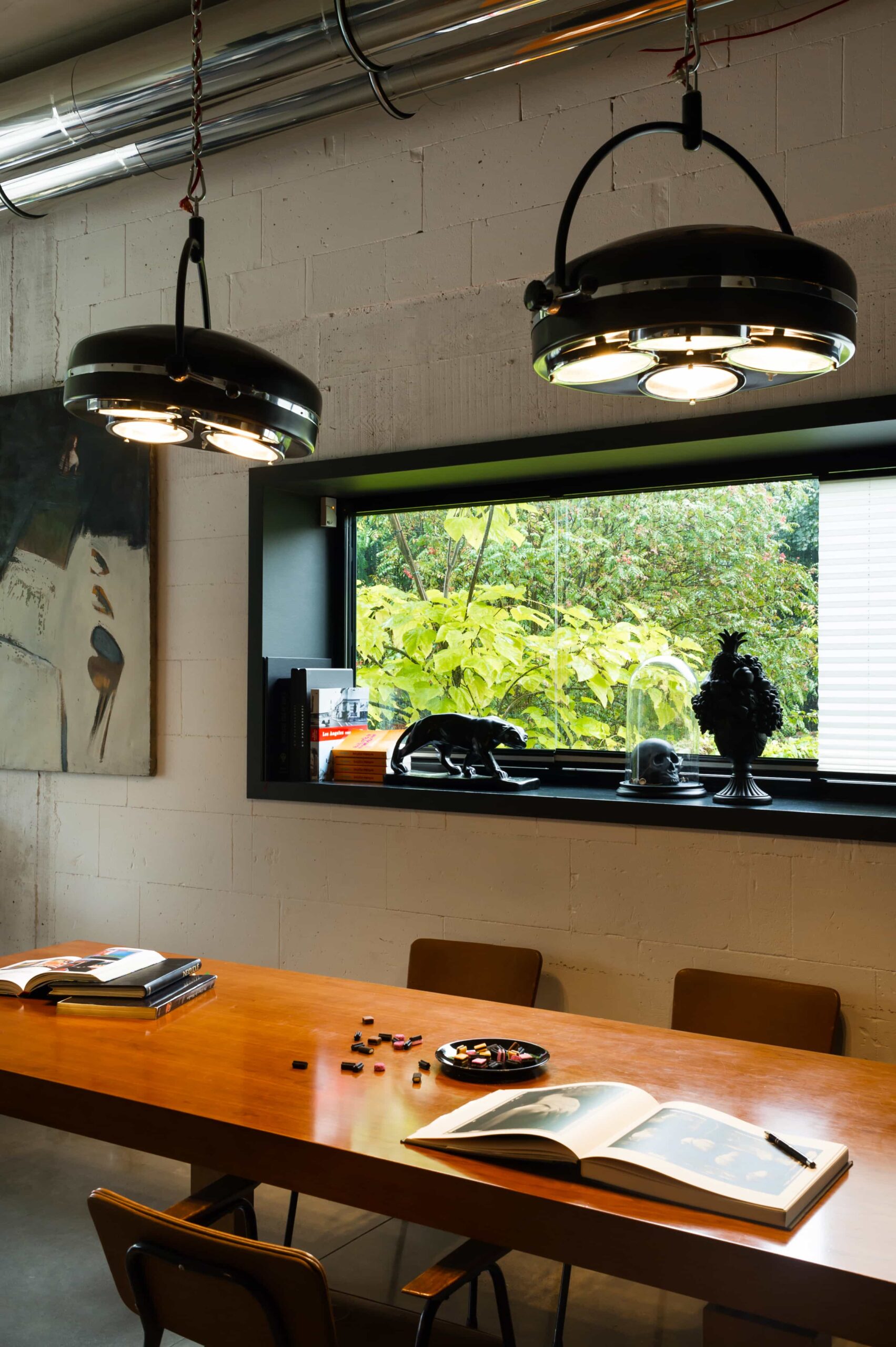
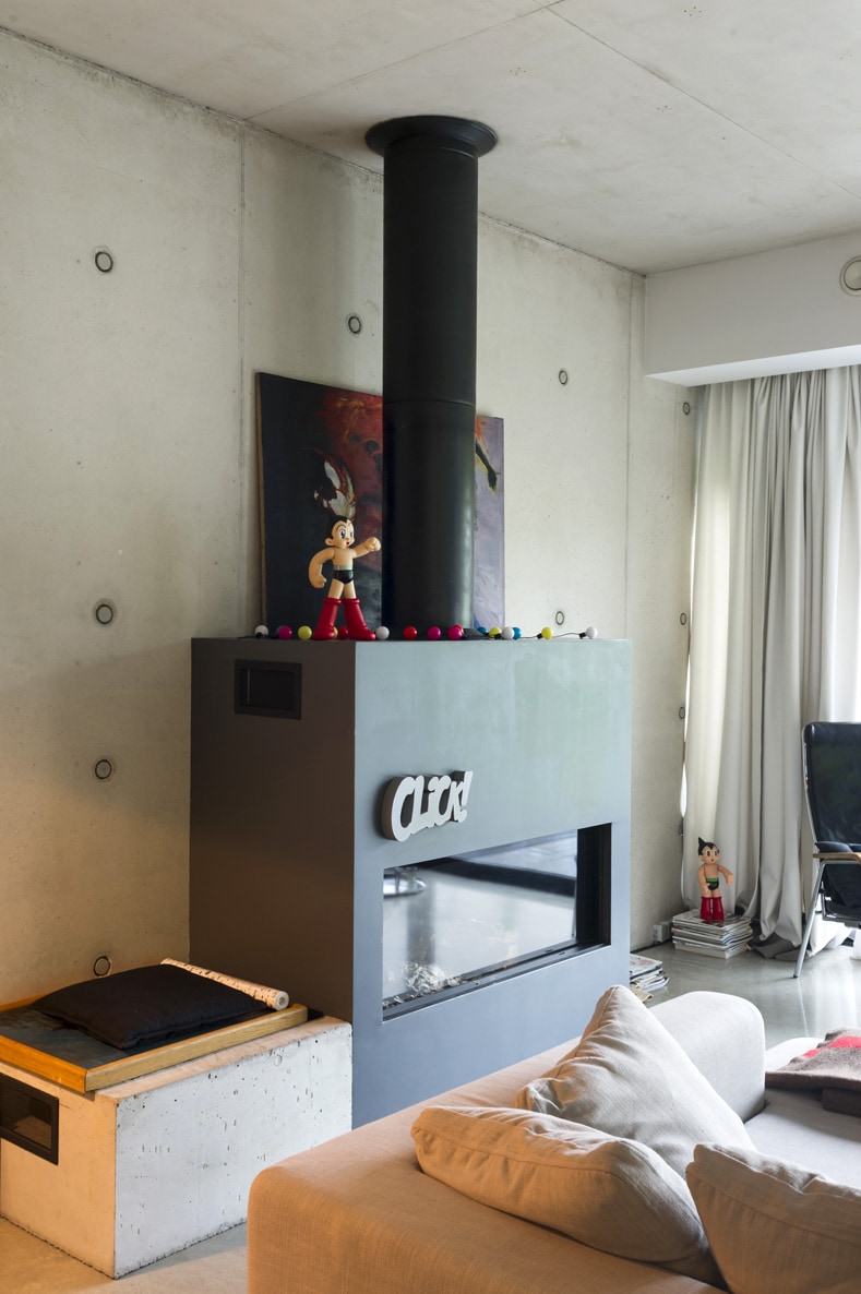
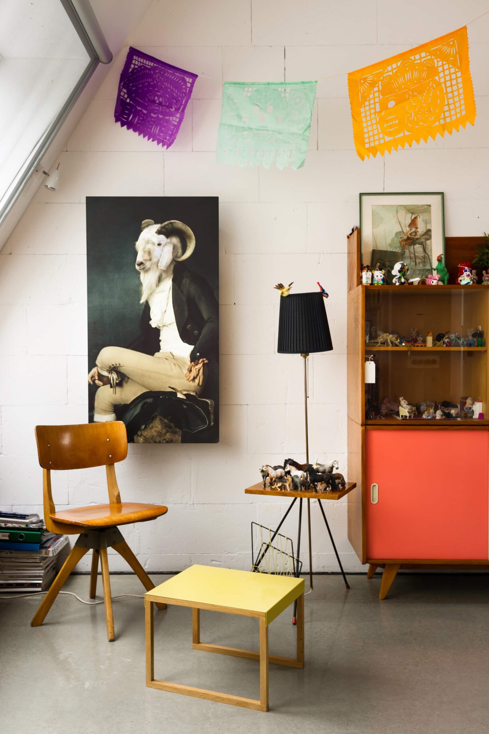
The house in Wilanów is the first experience with the obvious limitations of a narrow plot of land, a jungle of bureaucratic restrictions and unexpected problems with local residents. After years of living in Paris, a friend of mine who is a graphic designer decided to return to Poland with his wife and daughter. They found a beautiful strip of land, half – hidden from the street and with a magnificent view, sloping towards the royal ponds of Wilanów, with a gate leading to the waterside… And with a hostile neighbour on top of that, who was far from happy to have to agree to partitioning his own plot as a result of a family feud. He was even less happy about the prospect of a new house appearing next door, inhabited by cosmopolitan bohemians. The conflict developed when the house was being built, and it continues to this day, even though it has been five years since the plot was bought. The neighbourhood war is slightly alleviated by the interior of the new house – it was tailored precisely to the needs of the family who designed it. Due to the sloping terrain, the ground floor of the building was divided into two zones located on one axis.

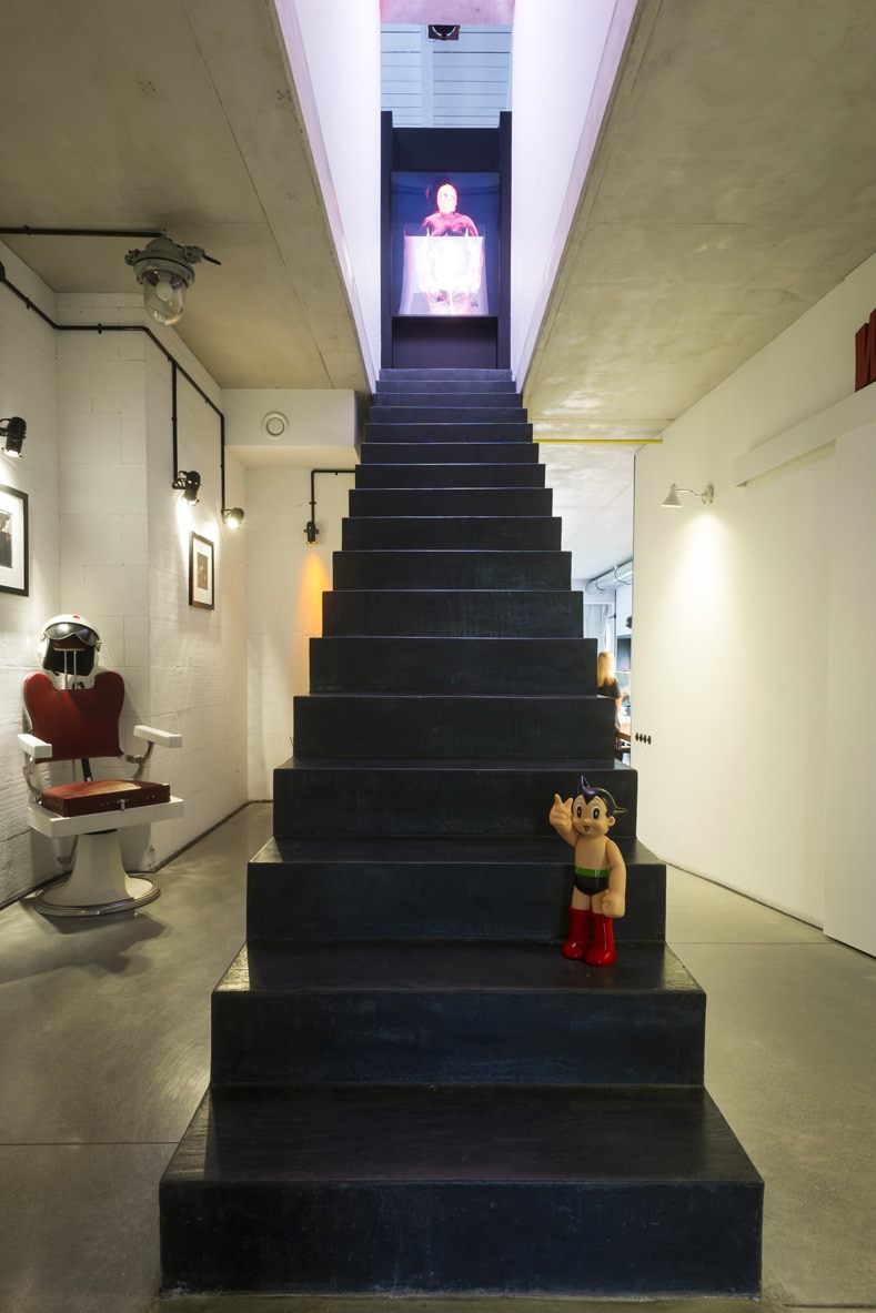
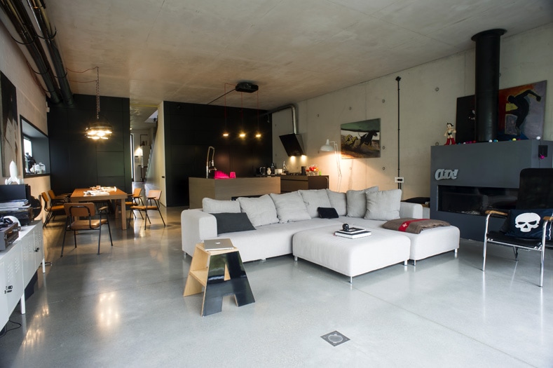
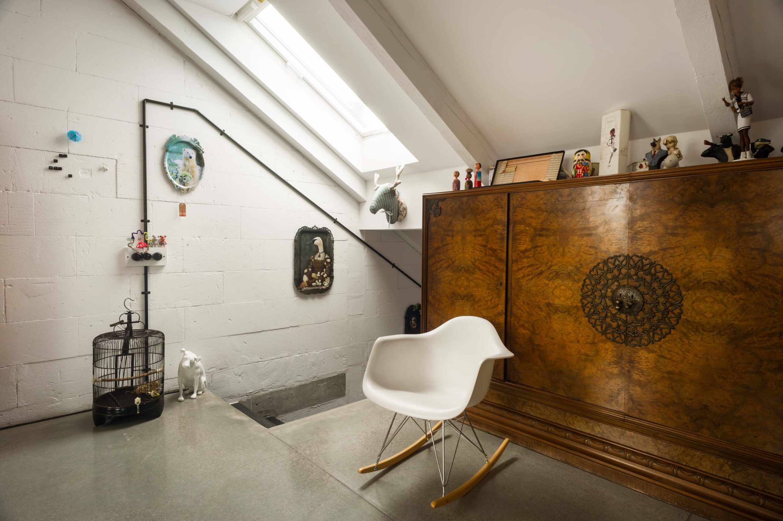
The hall, with its adjacent guest bedroom with a bathroom and boiler room, takes you naturally to a tall living room with a kitchen and dining room, then to a terrace and further down the artificial hill towards the gate leading to the pond. From the hall you may also climb the stairs to the upper – floor studio overlooking the pond, and the parents’ bedroom overlooking the street, with an en suite bathroom and wardrobe. Further up, in the attic covered with a gabled roof, there is the daughter’s bedroom with a view of the street and a skylight overlooking the garden. The narrow plot necessitated the design of the building on the basis of a horizontal section and complying with the local planning requirement of sloping roofs. The shape of the building resembles a ‘slice’ of a traditional factory with a saw – tooth roof providing extra light to the deep tract and larger glass surfaces at its narrow ends. The case shows how a narrow plot of land may unexpectedly interlace with specific conditions of the social context, connecting – not always successfully– architecture with everyday life.